
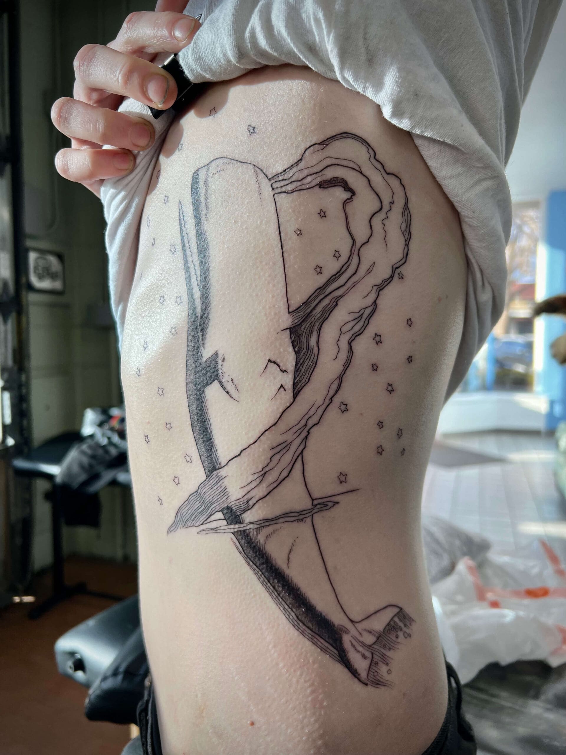
Fine line etched tattoo technique uses narrow contours, controlled hatching, stippling, and carefully spaced marks to recreate the appearance of historical engravings on skin.
The goal is not to fit the greatest possible number of lines into the design. The artist must preserve enough space, contrast, and structure for the image to remain readable after healing.
Key Takeaways
- Fine line etched tattoos depend on spacing as much as line thinness.
- Strong outer contours help protect the main silhouette.
- Hatching direction should follow the form of the subject.
- Cross-hatching should be concentrated in selected shadows.
- Open skin provides highlights and prevents crowded textures.
- Small designs need fewer internal marks than large pieces.
What Makes Fine Line Etched Tattooing Different?
Fine line etched tattoos use narrow marks to imitate the appearance of images cut or drawn into a metal printing plate.
Unlike minimal fine line tattoos, etched designs often contain repeated lines that build shadow, texture, and dimensional form.
The style may include botanical subjects, anatomy, animals, architecture, religious figures, or natural-history imagery.
Its defining feature is not line thickness alone. The arrangement of the lines must resemble printmaking through hatching, cross-hatching, contour shading, and controlled tonal groups.
A design can use very thin lines and still fail to look etched if the marks do not follow a clear structure.
Start With a Readable Silhouette
The outer shape should remain clear before internal texture is added.
A raven should still read as a raven without every feather line. A flower should remain recognizable before veins, stippling, and shadow marks are placed inside the petals.
Artists may use a slightly stronger outer contour than the internal lines. This creates separation from the background and helps the subject retain its identity.
The contour does not need to have the same thickness everywhere. It may become heavier in shadowed areas and lighter near open highlights.
Fine linework is most effective when it sits inside a stable overall shape.
Use Line Weight to Create Hierarchy
Line weight helps determine which areas appear closest, darkest, or most important.
The primary contour may be stronger than secondary textures. Facial features, symbolic objects, or major anatomical divisions may also receive slightly greater emphasis.
Background lines can be lighter and less dense. This prevents scenery, ornament, or texture from competing with the focal point.
| Line Type | Typical Role |
| Strong outer contour | Protects the silhouette |
| Medium structural line | Defines anatomy and major divisions |
| Fine internal line | Adds texture and subtle form |
| Broken line | Creates worn or distressed detail |
| Minimal linework | Preserves highlights and open space |
Follow the Form With Hatching
Hatching creates value through lines that move in the same general direction.
The line direction should describe the surface beneath it. Curved hatching can follow a cheek, skull, muscle, petal, or animal body.
Straighter marks may suit blades, books, architecture, armor, or other rigid subjects.
The lines can also suggest movement. Long curved strokes may show wind, flowing cloth, waves, smoke, or the direction of fur.
Random hatching may add texture, but it does not always create form. Each group of lines should follow the shape, material, or lighting of the subject.
Use Cross-Hatching Selectively
Cross-hatching creates darker values by placing one group of lines over another.
It works well in deep fabric folds, eye sockets, architectural recesses, animal shadows, and areas beneath overlapping objects.
The technique should not cover the entire tattoo. Too much cross-hatching can reduce tonal variety and make the image appear uniformly dark.
Artists often reserve the densest intersections for the deepest shadows. Lighter areas may contain only one set of widely spaced lines.
A third layer should be used carefully, especially in small designs. Dense intersections require enough room to remain visibly separate.
Control the Distance Between Lines
Spacing is one of the most important parts of fine line etched tattooing.
Lines that appear separate in a digital drawing or historical print may sit too close together when transferred to skin.
The artist may widen narrow gaps, reduce the number of hatch marks, or remove lines that do not improve the form.
More spacing does not necessarily make the design look unfinished. It can create stronger highlights and clearer tonal transitions.
| Spacing Choice | Visual Result | Main Consideration |
| Wide spacing | Light value and open form | May need stronger contours |
| Moderate spacing | Clear midtone | Suitable for most internal shading |
| Tight spacing | Deep shadow | Requires enough physical scale |
| Crossed tight spacing | Very dark value | May merge when overused |
| Open skin break | Highlight or separation | Must remain wide enough to read |
Protect Negative Space
Negative space is the uninked skin between contours, hatching, stippling, and black shapes.
These open areas create highlights and prevent individual sections from blending together.
A narrow gap may separate feathers, leaves, fingers, scales, petals, or folds of fabric. Larger open areas can divide the subject from its frame or background.
Negative space should be planned before the design becomes crowded. Removing a line from the drawing is easier than trying to restore a highlight after the skin has been tattooed.
Small fine line designs usually need more open space in proportion to their size.
Build Clear Tonal Groups
Fine line does not mean every part of the image should remain light.
The design still needs distinct highlights, midtones, shadows, and focal accents.
Open skin can form the brightest areas. Widely spaced hatching creates light midtones, denser lines create dark midtones, and selective cross-hatching or black can establish the deepest shadows.
A clear value structure helps the image remain understandable from a normal viewing distance.
The artist may reduce the design in size during planning. If the main figure disappears into the texture, the tonal groups need stronger separation.
Combine Fine Lines With Small Black Anchors
Some fine etched tattoos benefit from limited areas of solid black.
Small black shapes can strengthen pupils, eye sockets, flower centers, fabric recesses, windows, feathers, or architectural openings.
These anchors prevent the design from appearing pale or visually weightless.
Black should be placed where it supports the lighting and composition. Random dark accents can make the shading feel inconsistent.
The amount of black depends on the subject and desired appearance. A delicate botanical tattoo may use only a few accents, while a medieval engraving may require stronger shadows.
Simplify Small Designs
Fine line does not make unlimited detail possible at a small scale.
A small design should focus on one clear flower, insect, animal head, heart, skull, dagger, moon, or symbolic object.
Long inscriptions, tiny faces, dense borders, and several overlapping subjects often need to be removed.
A simplified design can still feel intricate when the artist uses a few well-placed hatch groups, contour lines, and black accents.
The most important features should receive the available detail. Secondary textures can be suggested rather than fully described.
Common Technique Problems
| Problem | Likely Cause | Better Approach |
| Tattoo appears too dark | Hatching is too dense | Remove lines or increase spacing |
| Subject looks flat | Line direction ignores form | Follow the surface and lighting |
| Details compete equally | No visual hierarchy | Concentrate detail near the focal point |
| Highlights disappear | Skin breaks are too narrow | Preserve wider open areas |
| Small features become unclear | Design is too compressed | Increase scale or simplify |
| Texture looks random | Marks lack consistent direction | Use a planned line system |
| Fine lines feel weak | No structural contrast | Strengthen selected contours or black accents |
Most of these problems should be addressed during the drawing stage rather than after tattooing begins.
Frequently Asked Questions
Can fine line etched tattoos include smooth gray shading?
Yes. Some artists combine engraved lines with limited smooth shading, although the line system should remain visually dominant if the goal is an etched appearance.
Are single-needle machines required for this technique?
No. Needle selection depends on the artist, subject, line weight, placement, and desired healed result.
Can fine etched linework be added around an existing tattoo?
Sometimes. The existing tattoo’s style, spacing, darkness, and placement will determine whether the new linework can be integrated clearly.
Does every hatch line need to appear in the stencil?
No. Some artists stencil the main structure and add selected texture or shading lines during tattooing based on the approved design.
Fine Detail Works Best When Every Line Has a Purpose
Fine line etched tattoo technique is not about making every mark as thin or dense as possible.
The strongest designs use a readable silhouette, controlled line weight, directional hatching, clear tonal groups, and durable negative space.
Small tattoos need focused subjects and fewer internal marks. Larger pieces can support more texture, but the focal point should still remain clear.
When spacing and hierarchy are planned carefully, fine etched linework can create detailed tattoos without sacrificing readability.